Overview
Case snapshot
A personal visual system for LinkedIn posts about AI, work and life.
- Project
- A LinkedIn image series for my personal posts about AI.
- Goal
- Create a repeatable way to generate images that feel connected to one visual world and support the post idea without replacing the writing.
- Source material
- My photos, my usual clothes and style, Patagonia scenery, previous successful images, and the recurring idea of AI as a visible assistant or team.
- Visual world
- Cinematic realistic images with a light comic layer: natural backgrounds, my avatar, translucent AI characters, short readable text and situations that are easy to understand in a LinkedIn feed.
- AI role
- AI helps generate and iterate the visuals. For the text itself, I mostly use AI as an editor.
- Human role
- I choose the idea, define the visual metaphor, review the output, correct what feels wrong and decide when the image is strong enough to publish.
I write these posts myself. The ideas, the angle and the personal observations are mine. Sometimes I use ChatGPT as an editor to polish the language, but I do not use it to replace the thinking behind the post.
The visual layer works differently. For images, I use AI much more actively. I wanted a recognizable world around my posts: my avatar, my natural Patagonia background, a recurring AI character, and small scenes that make abstract thoughts about AI easier to feel and remember.
I also did not try to make the images look like real photos. They are illustrations. It is okay that they are clearly AI-generated. The important part is that they are thoughtful, consistent and useful for the post.
Why I created a system instead of generating one-off images
AI-generated images are everywhere now.
Professional designers, marketers and artists use these tools at a very high level. They build complex visual campaigns, product images, editorial illustrations and advertising assets.
At the same time, many people use image generation in the fastest possible way: one prompt, one image, publish. Sometimes it works. Other times the result has strange text, inconsistent characters, random style or an idea that feels disconnected from the post.
I wanted something practical in the middle.
This series is not a professional design studio workflow. It is a system that one expert, consultant, creator or small company can actually use. Fast enough for regular content, structured enough to avoid random one-prompt visuals.
The goal was to create images that are obviously AI-generated and still have an idea, character, visual consistency and a recognizable world.
For me, that started with the avatar.
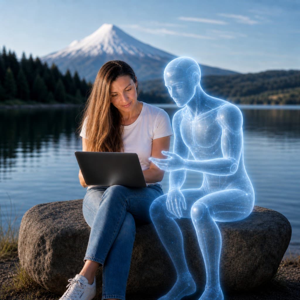
I did not need just “a woman in Patagonia.” I needed a stable version of myself that could work as a recurring visual character: close to my appearance, my hair, my usual clothes, my natural style. I also needed a stable AI character: a translucent, blue-white, friendly AI figure that could appear as an assistant, collaborator, editor or team.
Once those elements were fixed, every next image became much faster.
The source layer: avatar, AI character and visual world
The first stage was not about writing a perfect prompt for one image. I had to define the visual world. The system needed several stable elements.
- Avatar
- A recurring version of me, based on my photos, with natural hair, plain white T-shirt, blue jeans, white sneakers and no unnecessary accessories.
- AI character
- A translucent blue-white humanoid figure, clearly AI, friendly and collaborative. Sometimes it appears as one assistant, sometimes as a team of agents.
- Environment
- Patagonia scenery: lakes, mountains, volcanoes, open viewpoints, outdoor work settings. This connects the visuals to my real life instead of a generic futuristic office.
- Tone
- Realistic, clean, slightly funny, and easy to understand in a LinkedIn feed. I wanted the images to feel premium, while still being memeable.
- Format
- Square 1:1 images for LinkedIn. The idea should be visible quickly, even when the image is small.
This became the visual foundation. Without it, every new image would start from zero. With it, the AI tool has a stable world to return to.
Workflow / 01
I start from the post idea, not from the image
For this series, the post comes first.
I write the thought myself: what I noticed, what I think about AI, what feels useful or strange, what changed in my work, what I want to say from my own experience.
Only after that I think about the visual.
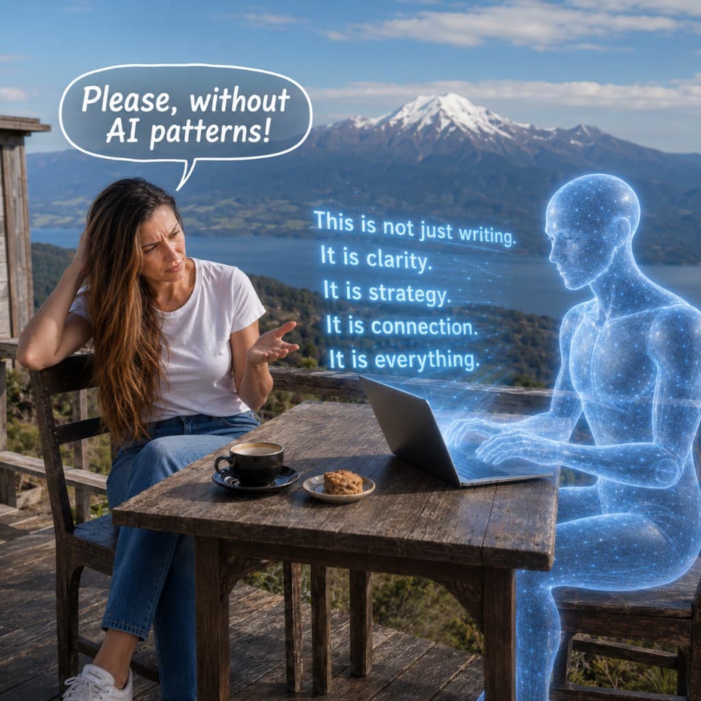
The image has one job: turn the idea into a small scene. A post about AI changing how we think can show AI as a thinking partner. A post about generic AI writing patterns can show me reacting to a glowing AI text that sounds too polished and too empty. A post about workflow can show AI agents as a team that needs roles and structure.
This keeps the visual connected to the thought. The image does not invent the message. It translates it into a scene.
Prompt logic
How I start the visual idea
I start with the idea of the post and ask what situation would make this thought visible in one image. Then I define the scene before writing the full generation prompt.
Workflow
I create a benchmark avatar and benchmark visual style
The beginning is the slowest part.
Before the system can be fast, I need a benchmark image: a version of the avatar, AI character, environment and style that feels right enough to reuse.
This stage takes more iterations. The face may drift, the setting may become too generic, the AI figure may look too robotic, too human, too scary, or simply disconnected from the post. Sometimes the image is pretty, but the idea is weak.
That is why the benchmark matters.
Once I have an image that works, I can use it as a visual reference for the next ones. The system now has something to compare against: the type of avatar, the AI character, the mood, the level of realism, and the style of humor.
Perfect photorealism was never the goal. I wanted the image to feel personal and realistic enough, while still clearly working as an AI-generated illustration.
Prompt logic
How I build the benchmark
First, create the benchmark. Do not rush into many images before the avatar, AI character and style are stable enough. Then use this benchmark as the reference point for future generations.
Workflow
I define the visual system in rules
After the benchmark image, I turn the visual decisions into rules.
This is what makes the workflow repeatable.
The rules include:
- square 1:1 format
- cinematic realistic photo style with a light comic feeling
- Patagonia scenery with mountains, lakes or volcanoes
- my avatar in natural clothes and natural body language
- blue-white translucent AI characters
- friendly, collaborative interaction
- very little text inside the image
- large readable speech bubbles or labels when text is needed
- one clear idea per image
These rules are saved inside the project or dedicated chat. I do this so I do not need to explain everything from the beginning every time.
When the AI tool has the benchmark image, the recurring characters and the written rules, the next task becomes much easier. I can say what the next post is about and ask it to build the new scene inside the same world.
Prompt logic
How I keep the visual world stable
The style rules are part of the system. They describe the avatar, the AI character, the setting, the format, the text rules and the emotional tone. Every new image should follow them unless I intentionally change something.
Workflow
I turn the new post into a visual scene
For each new image, I avoid vague prompts like “make a picture about AI.”
The first question is: what is happening in the scene?
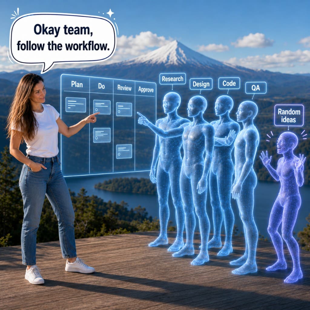
For the workflow post, the idea was simple: AI works better when there is a process. The scene became a small AI team standing near a transparent Kanban board. The agents had roles: Research, Design, Code, QA. One extra robot represented “Random ideas.” The joke came from the situation: the team has to follow the workflow, and the random-ideas robot wants to interrupt.
That is much stronger than an abstract image about productivity.
The same logic works for other posts. A post about AI writing patterns needs a scene where the AI text is visible and I am reacting to it. A post about quiet collaboration needs a calmer setup where AI is beside me, supporting the thinking process.
Good AI images need a situation. When the scene explains the idea clearly, the image depends less on the caption.
Prompt logic
How I create the scene
For each post, I define the visual metaphor first. What is happening in the image? Who is there? What is the small tension or joke? What should the reader understand in two seconds?
Workflow
I review the image like a creative director
The first output is rarely final.
This is where most of the real work happens. I look at the image and check whether it actually fits the system.
In the workflow image, the first version was close, but several details needed correction. The text had to be bigger. The speech bubble needed to match the style of previous images. My pose had to feel more natural. The role labels had to be more visible.
That feedback made the image stronger. It also gave the system better rules for the next images.
Review checklist
- Does the avatar still look like me?
- Does the age and face feel natural?
- Does the background still feel like Patagonia, not a random travel postcard?
- Is the AI character consistent with the previous images?
- Is the text readable?
- Is the pose natural?
- Does the image communicate the idea without extra explanation?
- Is the humor clear?
- Does anything look too chaotic, too polished or too generic?
Prompt logic
How I review the output
Do not accept the image only because it looks impressive. Check identity, story, readability, composition and consistency with the benchmark.
Workflow
I save the corrections and reuse the system
After a few images, the process becomes faster.
The AI does not suddenly become perfect. The difference is that the system now has memory: benchmark images, style rules, recurring characters, known mistakes and review criteria.
For the next image, I can give a shorter task:
Here is the new post idea. Use the same visual world. Keep my avatar and AI character consistent. Create a scene that explains this thought. Use the same level of realism, Patagonia setting, light comic tone and LinkedIn-friendly format.
Then I review the output against the benchmark.
This is the real value of the system. The first images take more work because they build the visual language. After that, each next image is no longer a fresh experiment. It is a new scene inside an existing world.
Prompt logic
How the system becomes faster
Once the benchmark and rules exist, the next prompt can be much shorter. The task becomes: apply the system to a new idea, then review the result against the benchmark.
Fixes
What was difficult and how I fixed it
The avatar did not stay stable at first
The face could look wrong, older or less natural. This is one of the most important things to fix early. If the recurring avatar is weak, the whole series feels random.
How to avoid it
Create a benchmark avatar first. Use reference photos, correct the face early and do not move to many image concepts before the main character feels stable enough.
The background could become too generic
“Patagonia” is still a broad direction. The image can drift into a beach, a random mountain view or a tourist postcard.
How to avoid it
Describe the setting more specifically: mountain viewpoint, lake, volcanoes, calm natural background, outdoor work atmosphere. Keep the background beautiful, but secondary.
The text inside images can fail easily
AI-generated text can become too small, misspelled or visually weak. This is especially risky for LinkedIn, where the image is seen quickly and often on mobile.
How to avoid it
Use very little text. Make the phrase exact. Ask for large readable bubbles or labels. Review the image at feed size, not only in full screen.
The image can look good but miss the idea
A beautiful image is not enough. The post needs a visual situation. If the characters do not interact, the image becomes decorative.
How to avoid it
Define the scene as a small story. Who is doing what? What is the tension? What is funny or useful about it? In the workflow image, the “Random ideas” robot only works because the rest of the team reacts to it.
Outcome
What this system makes possible
This system gives me a way to create images for personal posts without starting from zero each time.
The writing stays personal. I still decide what I think, what I want to say and how I want the post to sound. The image system adds another layer: a visual world that helps these thoughts become easier to notice, remember and share.
Consistency is the first result.
Each image can show a different situation and still read as part of one series. Over time, readers start to recognize the same avatar, the recurring AI figure, the Patagonia setting, and a tone that stays realistic, thoughtful, a bit funny, and clearly about how people work with AI.
Speed comes next.
Once the benchmark image and rules exist, I do not need to rebuild the style every time. I can take the next post idea, turn it into a scene, generate the image inside the same world, review it and publish.
The third result is a stronger visual identity.
The images do not look like generic AI stock visuals. They are still AI-generated, but they have a point of view: my environment, my avatar, my way of thinking about AI, and a recurring AI character that makes the series more recognizable.
Outcome cards
Benchmark image
One strong reference image sets the avatar, AI character, tone and visual standard.
Reusable rules
The system saves style, setting, character and text rules so every new image does not start from zero.
Faster production
New images can be created faster because the visual world already exists.
Recognizable series
Different posts can have different scenes while still feeling connected.
Transfer
What other experts and businesses can adapt
This workflow can work for more than a personal LinkedIn series.
Experts, consultants, educators, founders and small teams can use the same logic to create a visual layer around their ideas. It can be useful for posts, article covers, course materials, memes, internal explainers, presentation visuals or small content campaigns.
The important part is to define the system before generating many images.
A useful visual system needs:
- Recurring character or brand presence It can be a person, avatar, team, product object, mascot or visual metaphor.
- Recognizable environment This can be a real place, a product interface, a workspace, a classroom, a studio or an abstract brand world.
- Clear tone Serious, comic, reflective, premium, educational, playful — but chosen intentionally.
- Benchmark image One image that becomes the reference for style, quality and consistency.
- Prompt rules A saved description of characters, setting, format, text rules and emotional tone.
- Review criteria A checklist for what usually goes wrong: face, text, pose, consistency, composition, idea clarity.
This is a practical middle layer between professional design production and random one-prompt images. It does not replace designers or art direction. It gives experts and small teams a way to create more engaging visuals when they have ideas, but do not have a design team for every post.
Next step
Want to build a visual AI workflow around your ideas?
If you already write, teach, consult or share ideas publicly, AI image generation can become more than decoration. With the right source material, benchmark image, style rules and review process, you can build a repeatable visual system around your content — one that keeps your voice, your context and your point of view visible.

